

Up until now Quotify has done one job really well: capture quote enquiries through a form. That’s a good job. But it’s only the first job.
Anyone who’s actually sold a service for a living knows what happens next. The enquiry hits your inbox, you mean to follow up that afternoon, then a week later you find it again at the bottom of a thread you forgot to reply to. The form did its bit. Everything after that was on you.
This update changes that. Quotify now handles the bits after the form too. Here are the five biggest pieces.
1. Branded quote PDFs in customer emails
Toggle “Attach quote as PDF” on any form and the confirmation email (both yours and your customer’s) comes with a clean PDF attached.
Your logo, business name, address, phone, email and website sit at the top. Set those once in Account → Organisation and every PDF picks them up. The quote looks like it came from your business. Not a generic SaaS confirmation with your brand awkwardly bolted on.
For a lot of service businesses this is the difference between “I got an email” and “I got a quote.” Same content, very different feeling at the other end.
2. A lead inbox, not a notification feed
Submissions don’t just pile up anymore. They flow through a pipeline:
New → Contacted → Booked → Lost
Filter chips at the top let you switch between stages, so when you sit down on a Monday morning the only thing in front of you is what actually needs chasing.
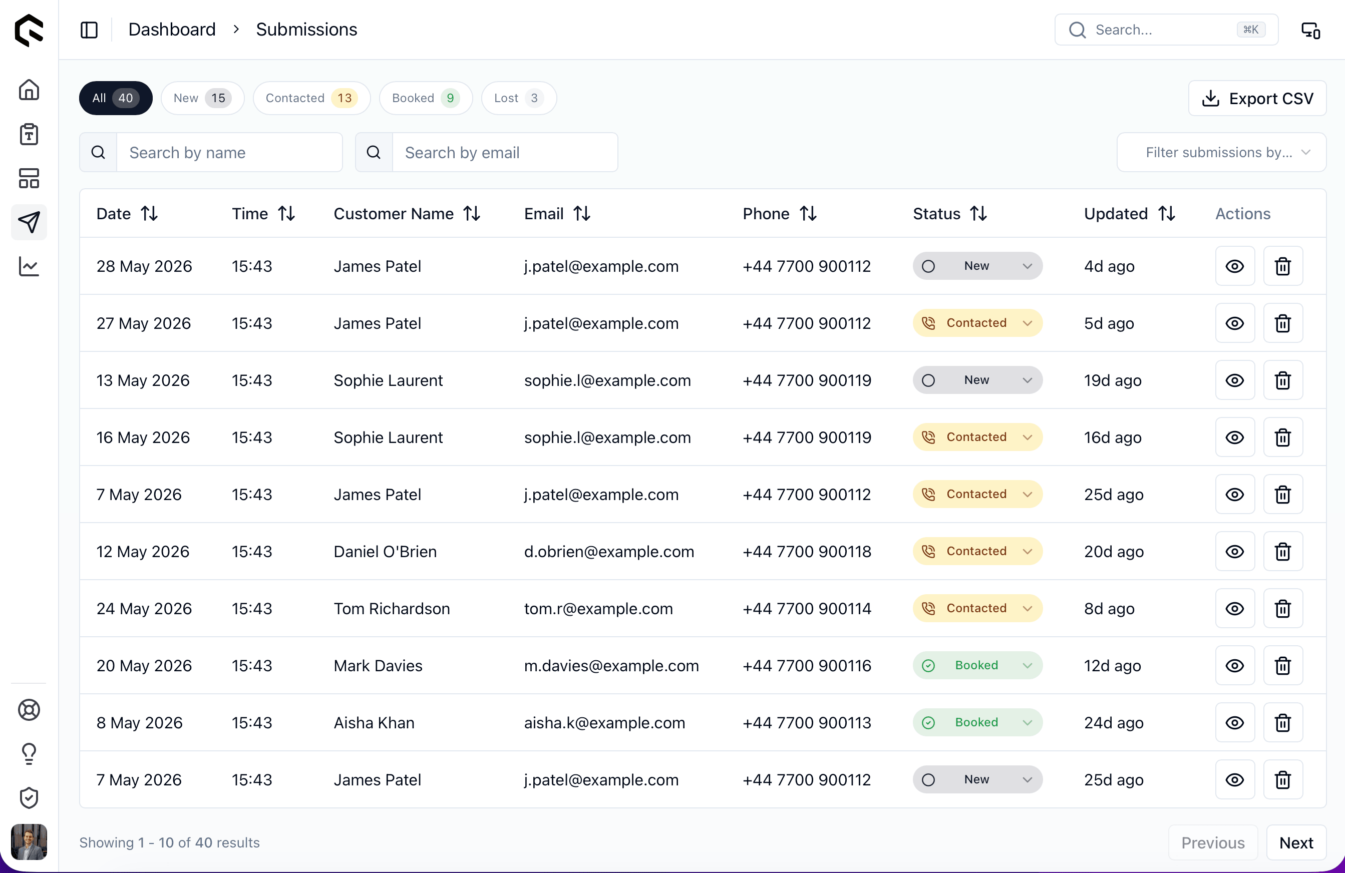
The bit I’m most proud of is the 24-hour reminder. A scheduled job runs in the background and emails you a digest whenever a lead has been sitting in “New” for a day. It’s annoying in the way an alarm clock is annoying, i.e. exactly enough to make you do the thing.
Per-form recipient email, per-account opt-out, one-click unsubscribe: all the right toggles are there.
3. Landing pages v1
Every form can now have its own public landing page. SEO fields (title, description, OG image), a custom slug, your CTA, share and duplicate buttons, and built-in analytics for views and conversions.
If you don’t have a website (or your website is the kind that hasn’t been updated since 2019) your form is now its own page. Send the link, embed it in your email signature, throw it on a business card.
Submissions are attributed back to the landing page and the traffic source they came from, so you can see which channels are actually pulling their weight (more on that in a sec).
4. Webhooks that retry, and a log that proves it
If you’ve ever connected Quotify to Zapier, Make.com, or your own webhook endpoint and had a submission silently fail because Zap was rate-limited or your server hiccuped, that doesn’t happen anymore.
The per-form webhook (generic and Zapier-compatible; Make.com hooks into the generic one too) now retries automatically with backoff. Every attempt is logged. Under Integrations you’ll find a Recent deliveries panel showing status code, retry pill, duration, and how long ago each delivery happened.
The point isn’t that webhooks now never fail. It’s that when one does, you can see it, understand why, and fix it without leaving Quotify.
5. Analytics that show you what’s actually working
The analytics page got a real upgrade. Period-over-period deltas, top traffic sources, mobile vs desktop split, a leaderboard of best-performing forms, and landing-page metrics sitting next to form metrics with the attribution joined up.
When a submission comes in, you can trace it back: which landing page it came from, which source brought the visitor to that landing page, which form they filled out, and what stage that lead is at now. That’s the whole funnel in one place.
If you’ve been running paid traffic or sharing landing-page links anywhere, this is the page worth bookmarking.
And a heap of polish
The five things above are the headliners. There’s also a stack of smaller-but-real improvements that shipped alongside — the kind of work that doesn’t get its own announcement but adds up to a noticeably nicer Quotify to actually work in.
Form builder:
- Range slider question type: set the start point, floating min/max labels, optional required toggle. It correctly rejects 0 when 0 is the floor (which sounds obvious until you try it in other tools).
- Floating labels on text inputs, MUI-outlined style. The builder now reads as cleanly as the public forms do.
- Discoverable Share: there’s a Share tab AND a dedicated header Share button, so customers don’t have to dig for the public link.
- Required toggle on any question: the old amber “required” badge has been replaced with a proper green Switch.
- Sticky Save button: always within reach, no more scrolling to the bottom to commit a small edit.
- Conditional logic on questions and steps: show/hide based on earlier answers. Shipped a little earlier but it deserves another mention since it changes what kinds of forms you can build entirely.
Look and feel:
- Auth pages redesign: split-screen with a benefit-focused dark brand hero (subtle gradient, three benefit lines), tighter form rhythm, the magic-link button promoted to first-class, and a top-right Sign-in/Sign-up swap so you can flip without going back. (That’s the redesigned sign-in screen at the top of this post.)
- Mobile polish: the sidebar now closes when you tap a link, the active page is highlighted, settings drawer tabs scroll horizontally instead of squashing, and the dashboard stat cards drop to 2 columns instead of compressing to unreadable.
- Accessibility: a Tab + Enter “skip to content” link, plus focus rings across every interactive element. Long overdue.
- Friendlier error toasts: specific titles (“Couldn’t save that change”) instead of the old “Uh oh :(”, and proper red destructive variants when something actually failed.
Quality of life:
- CSV export of submissions on
/dashboard/submissions, respecting whatever filters you’ve got active, so you can export just the New leads or just last month’s bookings. - Magic-link sign-in alongside the existing email/password: paste the email, click the link, in.
- Sign-up captures your name and persists it to your profile and through to Mailerlite, so no more “Hi there” emails.
- Templates library to start a form from: themed packs for service businesses, content services, and a few more on the way.
Under the hood:
- Email now goes through Resend as primary with SMTP fallback, which is a quiet but meaningful deliverability win.
- Tokenised UI colours so the green rebrand is one variable swap away from being a different brand entirely. Relevant if any of you have been asking about white-label.
- Security hardening across the upload, email-send and signup paths. The kind of fixes that are interesting only insofar as you never notice them.
What this update is really about
I started Quotify because pricing forms shouldn’t be hard. That’s still true. But “capture the enquiry” is only the beginning of the job, and treating it as the whole job is how leads end up dying in inboxes.
The five things above are what it takes to actually run quotes through Quotify rather than to Quotify. PDF in the customer’s hands. Lead in a pipeline you can see. Landing page you can share. Webhook you can trust. Analytics that tell you which bit is working.
If you haven’t logged in for a while, this is a good week to come back and have a poke around. As always, if you spot something that’s wonky or have an idea for what should be next, drop me a line, or read more about why I’m building Quotify if you fancy the longer version.