

Following the recent enhancements to the font & colour options and our even bigger launch of landing pages, it felt like the right time to spend some time refactoring and refining parts of the web app behind the scenes.
Not every update needs to be a big feature release, sometimes the most important updates are the ones that make everything run smoother, faster, and easier to use day-to-day. This latest release is very much focused on that: small, meaningful improvements that improve the overall Quotify experience.
Here’re the improvements shipped:
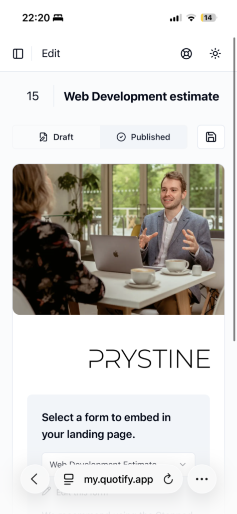
Improved mobile editing experience for landing pages
You can now more comfortably build and edit your forms and landing pages directly from your mobile device. While we’d still recommend using a desktop for the best experience, we know many of our users need to make quick changes on the go, so we’ve made the editor more mobile-friendly and easier to navigate on smaller screens.
Improved layout handling for larger forms on landing pages
We’ve made adjustments to how larger and more complex forms are displayed within landing pages, improving spacing, alignment, and overall readability. This should make longer forms feel cleaner and easier for customers to complete.
Shorter form URLs
We’ve simplified the structure of form URLs so they’re now shorter and cleaner. This makes them easier to share, embed, and send to customers, and looks a bit nicer overall too.
Plus, back-end optimisations
We’ve also carried out some under-the-hood optimisations such as streamlining the code-base, and removing a now-redundant table in the database to make Quotify even more performance driven and ensure long term maintainability for the future releases we’ve got planned!
As always, we’re continuing to refine and improve Quotify based on how people are actually using it, with plenty more improvements on the way.
Got an idea? Let us know.