

We’ve just rolled out a visual upgrade to checkboxes and radio inputs in Quotify forms.
What’s changed
- Checkbox and radio inputs can now be styled as clickable buttons.
- They still behave like checkboxes/radios (multi/single select).
- On selection, they’re styled using your brand colour (if you’re a pro subscriber).
- This provides a clean, accessible, mobile-friendly and much more user-friendly solution to your forms.
Why we did this
Traditional form inputs can feel clunky, especially in modern UI contexts. This new button-style approach makes option selection:
- More intuitive for end users
- Easier to scan and interact with
- Fully responsive and touch-friendly
Under the hood
- Inputs are still native HTML for accessibility & form integrity
- Visual styles are applied using peer, sr-only, and Tailwind’s arbitrary value support (peer-checked:[background-color:var(—brand-color)])
- Fully compatible with dynamic themes and dark/light modes
We’ve set the minimal (classic) inputs as default, so this change will only take place if you select the option from the form settings.
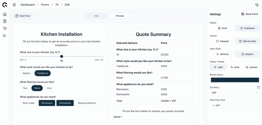
The new input style options on show along with the setting on the right.